Hey Ellis, thanks for letting us see the latest Demon comic pages. They look good except that I'm getting a fierce Moire pattern or something that's spoiling the look of the drawings. What's causing that, and can it be eliminated?
Tom. The moire goes away for me after I click with the magnifier icon to get the largest view. Then the samller view is also cleared of more. It seems to be a compression thing of the jpgs that manga studio generates.
Maybe Rick can tell me how to properly produce an image. I'm using export-image in pixels-300 dpi.
The 300 dpi is probably causing the problem. The jpg has to deal with a computer's screen setting on the smaller versions. The larger version it becomes as big as it was naturally meant to be viewed.
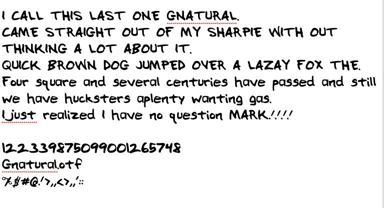
The balloons with my crumby lettering are what tickle me. I switch to sharpie-fine for the demon dialogue. I may come up with some sound effect alphabets that are my creation as well. Type them out, rasterize, distort them.
Dude, I love the fonts. Great looking stuff, and the variation from human to demon speak is very nice.
Sorry I've been MIA here. Holidays and arm surgery have kept me almost 100% off the computer recently...and trying to finish a bunch of projects before going under the surgeon's knife, (arm is good, I'm doing a little drawing for the first time today...just repairing some torn tendons).
I did no balloon work. Instead I downloaded a ton of fonts from blambot.com. Over 30. Anything with a hovering "F" over the fonts is free for indy comic publishers. Some very nice stuff. I'm going with my hand built fonts. But I may use these others for incidental things.

 And then used the font. Kinda cool getting back to this.


9 comments:
Hey Ellis, thanks for letting us see the latest Demon comic pages. They look good except that I'm getting a fierce Moire pattern or something that's spoiling the look of the drawings. What's causing that, and can it be eliminated?
Tom. The moire goes away for me after I click with the magnifier icon to get the largest view. Then the samller view is also cleared of more.
It seems to be a compression thing of the jpgs that manga studio generates.
Maybe Rick can tell me how to properly produce an image. I'm using export-image in pixels-300 dpi.
The 300 dpi is probably causing the problem. The jpg has to deal with a computer's screen setting on the smaller versions. The larger version it becomes as big as it was naturally meant to be viewed.
The balloons with my crumby lettering are what tickle me. I switch to sharpie-fine for the demon dialogue. I may come up with some sound effect alphabets that are my creation as well.
Type them out, rasterize, distort them.
I enlarged all the way up to 400% but it didn't reduce the Moire at all.
And you are talking about the middle image? Not the pencil roughs being given rough halftones by Manga Studio?
And Moire clarification. That ugly, screen door looking pattern of dark dots overlayed in a larger pattern than a field of smaller dots?
Or are you just seeing what you think is ugly tone?
That may be what I'm thinking is decent tones.
Dude, I love the fonts. Great looking stuff, and the variation from human to demon speak is very nice.
Sorry I've been MIA here. Holidays and arm surgery have kept me almost 100% off the computer recently...and trying to finish a bunch of projects before going under the surgeon's knife, (arm is good, I'm doing a little drawing for the first time today...just repairing some torn tendons).
Heal Marty Davis. I hope that healing goes well and gives you back your missing arm strength.
Load my fonts in your font folder and choose them for your txt program. Very small zip file. Type up a couple of things and have a look.
I'm going to finish the balloons tonight and do an output...
That hopefully doesn't moire.
I did no balloon work. Instead I downloaded a ton of fonts from blambot.com. Over 30. Anything with a hovering "F" over the fonts is free for indy comic publishers. Some very nice stuff. I'm going with my hand built fonts. But I may use these others for incidental things.
Post a Comment