


That guy I linked to below, DataJunkie, has all those great Pulp covers. I'm going to paint this thing but I'll use one of those pulp covers as a layer and straight up use it's lurid (but pleasingly complementary) color scheme. Then take it into the ART RAGE program and give it an oil look. Wish me luck.
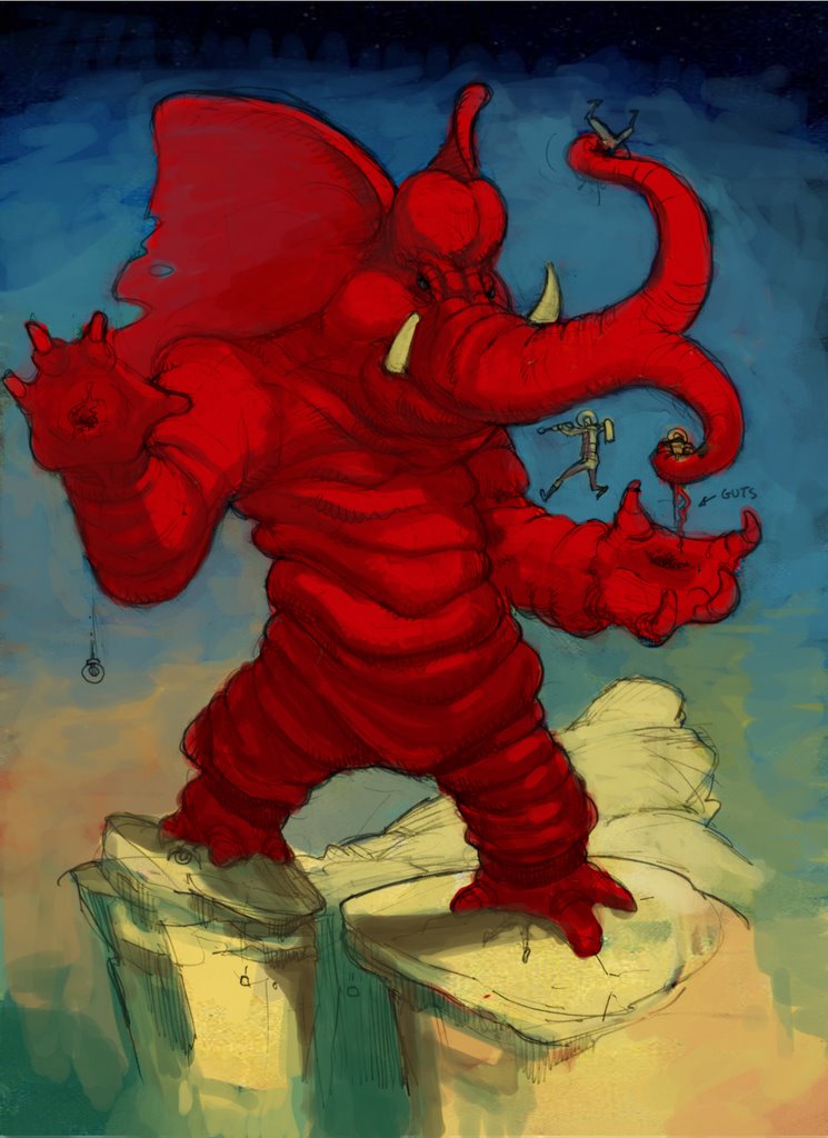
I started on the color last night. I brought in the color scheme of a pulp magazine and it was cool because it made me think about the color another artist had chosen. For instance I realized I can only go darker with that red on the elephant. The bright red is the lightest red. If it was me usingred, I'd mess it up by making a selection in photoshop and lightening. But studying the other artist, I realize that red should be the lighest the red gets.
I've Included the cover I got the color scheme from
2 comments:
That's fantastic Ellis. I especially like the little "guts" indicator sign. You've gotta keep that in the finished piece.
It's like Ganesh from Mars. An appropriate enemy forr an Indian Giant Robot.
You are a dangerous man, Mr Goodson.
But you were a very cute kid!
Post a Comment