beautiful Rick. Maybe make the foremost building pop a little more. Scrim the other buildings with a little atmosphere or increase the front one's saturation or something. And since it's obviously sunny lighting, you might make the shadows darker. Should make it seem sunnier.
Yeah, this got more sunny looking than I had originally planned... not that this is necessarily a bad thing, but it may require a few more adjustments like the ones you are suggesting. That back part of the building is in a different layer so I have some easy options available to me to create some atmospheric perspective. Thanks for the critique!
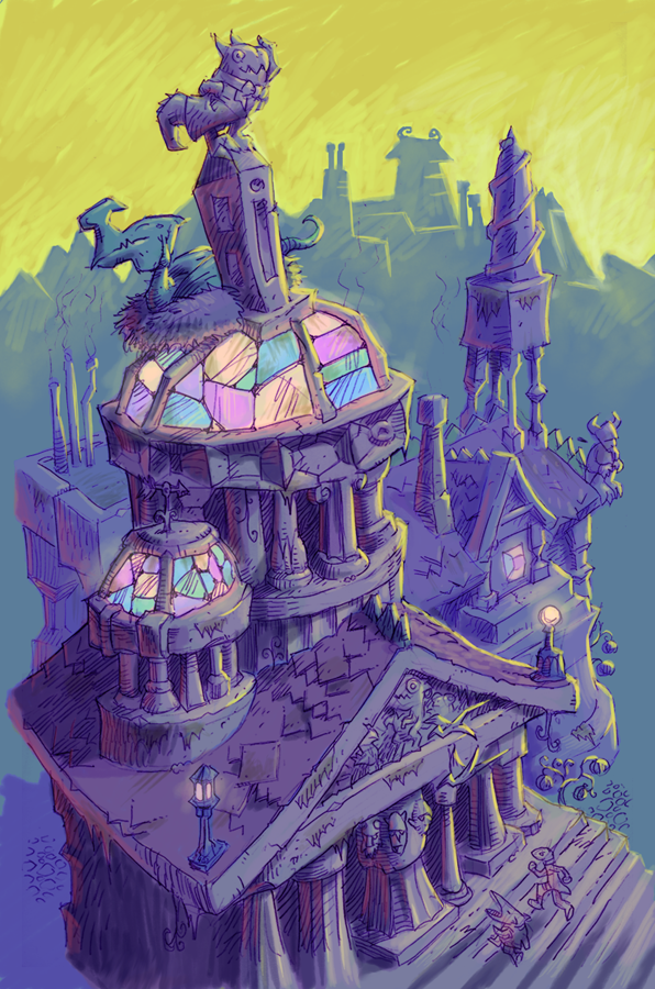
Marvelous! I wanted to suggest doing this drawing in color. In fact, you usually work in black and white and I usually want to say, "Let's see a color version!"
Besides giving it a whole new emotional dimension, color organizes a lot of the visual elements and clarifies them. Love it.
I do see color in these while working on the original drawing... I don't always have time to add color, but it's pretty fun when I do. I hope to have another iteration of this done tonight. It's already come quite a distance from the version seen here.
Interesting to see the unified cool version. For funsies, bring in the yellow orange version in as masked layer and paint parts of it back into the cool version. might be a good idea for some pop. Both versions look good. I guess I just want some more loving to the foreground focus elements.
I took my own suggestion and painted in some old over the new. And It didn't work the way I thought it would. I'm a great theorist. I would make a good art director. Telling people to do stuff that drove them crazy doing it, looking it over and then saying "that doesn't work."
Color reminds me of that famous Frazetta painting of Atlantis--the one of the Roman Centurion-style statue with the spear. Same yellow-vs.-purple color scheme. I painted a copy of that, and s.o.b if that Watts school didn't keep it.....


15 comments:
beautiful Rick. Maybe make the foremost building pop a little more.
Scrim the other buildings with a little atmosphere or increase the front one's saturation or something.
And since it's obviously sunny lighting, you might make the shadows darker. Should make it seem sunnier.
Yeah, this got more sunny looking than I had originally planned... not that this is necessarily a bad thing, but it may require a few more adjustments like the ones you are suggesting. That back part of the building is in a different layer so I have some easy options available to me to create some atmospheric perspective. Thanks for the critique!
Marvelous! I wanted to suggest doing this drawing in color. In fact, you usually work in black and white and I usually want to say, "Let's see a color version!"
Besides giving it a whole new emotional dimension, color organizes a lot of the visual elements and clarifies them. Love it.
A scene from the land of Creeple, isn't it?
I do see color in these while working on the original drawing... I don't always have time to add color, but it's pretty fun when I do. I hope to have another iteration of this done tonight. It's already come quite a distance from the version seen here.
The yumminess of your color caused me to open photoshop and just play with mixing color. Looking forward to the advanced result.
Interesting to see the unified cool version. For funsies, bring in the yellow orange version in as masked layer and paint parts of it back into the cool version. might be a good idea for some pop. Both versions look good. I guess I just want some more loving to the foreground focus elements.
I took my own suggestion and painted in some old over the new. And It didn't work the way I thought it would. I'm a great theorist. I would make a good art director. Telling people to do stuff that drove them crazy doing it, looking it over and then saying "that doesn't work."
Two thumbs up on the "Dawn" lighting version.
Dudes! Rick, I really love these--the building, the feel of the world, all of it. And I'm with Tom, your stuff really looks great with color.
I esp'ly love the "Dawn Lighting" version. Just great.
Color reminds me of that famous Frazetta painting of Atlantis--the one of the Roman Centurion-style statue with the spear. Same yellow-vs.-purple color scheme. I painted a copy of that, and s.o.b if that Watts school didn't keep it.....
Cool painting my ugliest of friends! Love the design.
Now you're lookin' real slick. Rim lighting, etc. Best yet! Love way you've developed it.
I like the new rim lighting. Very nice.
Looks terrific!
Post a Comment