
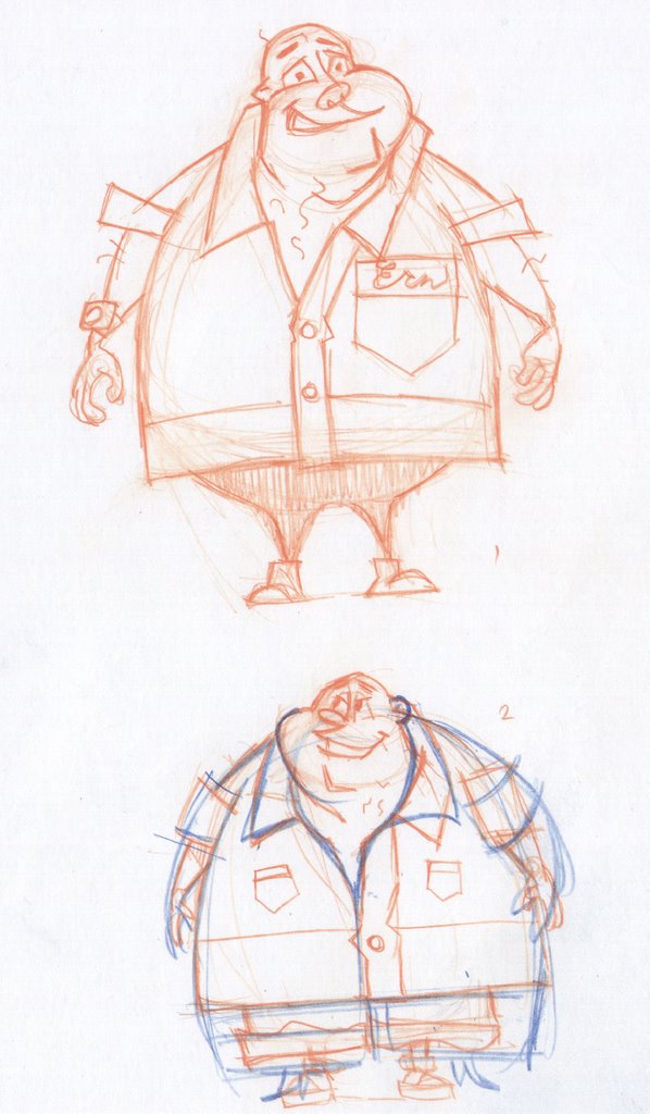

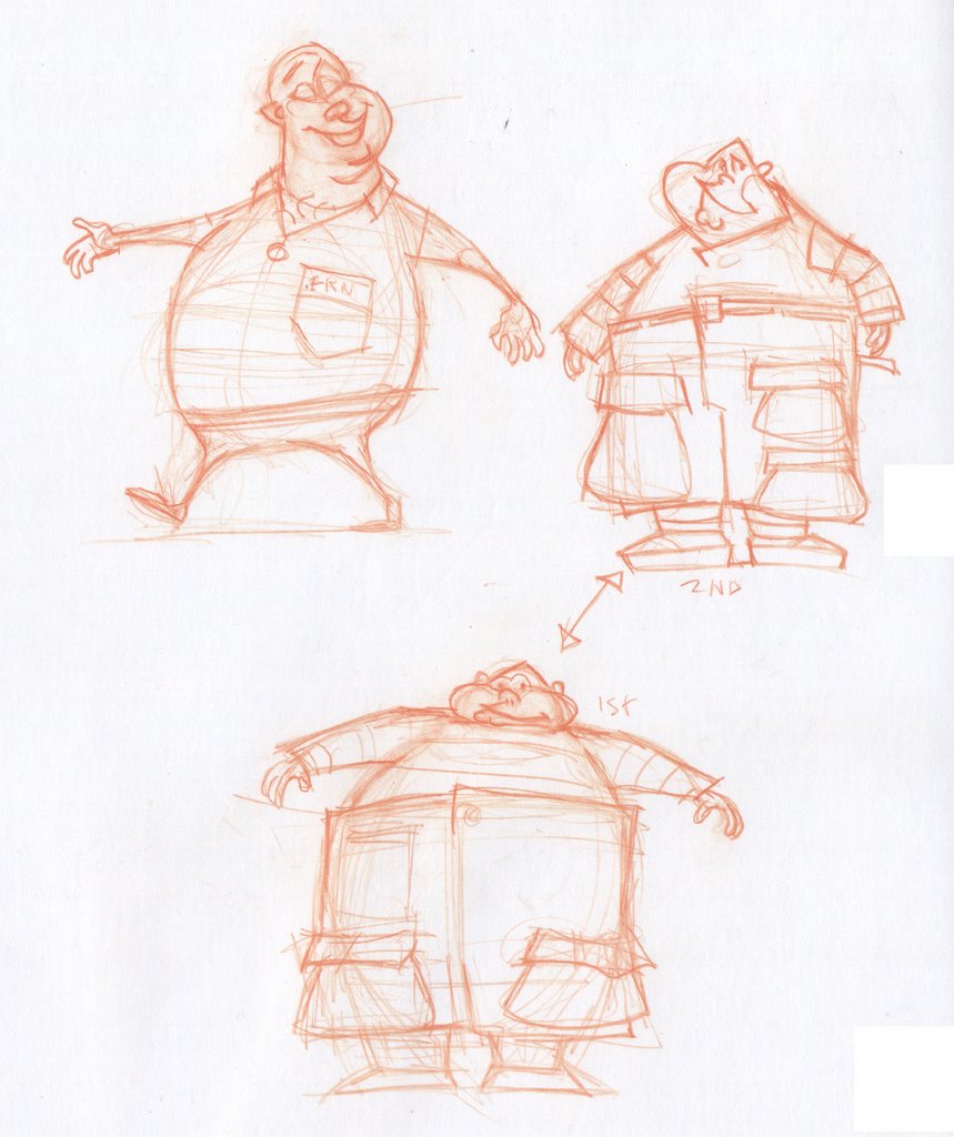
Examples of my attempt to get the swing of cartooney character design. The Blue pencil is Silver refining the designs I brought in. I went with the guy having a bowling shirt and kind of a childish demeanor. Thanks for the guidance on "cartooney" Jeff.
5 comments:
El, you look to be channeling yr inner Flintstone!
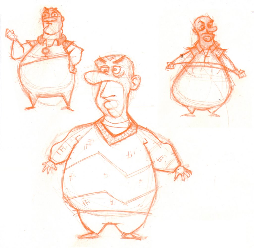
I like the personality of the big guy's face. I like your bold experimentation with extreme body bulbous-ity. and the sweater-set stylings of their wardrobes. Very alpaca.
I'm sure as you make more drawings of them, you'll get looser poses, less "twinning", etc. Historically, whenever I've ventured into cartoon character design (typically with disastrous results--thank gawd Vectorman's shape was basically determined beforehand!), I too always start from the most static poses (like I'm sculpting 'em). But these days, in the hot flush of my French renaissance, I've been trying to start a character with as dynamic a pose as I can conceive--in fact, the character sort of comes from the pose (like my "Unknown SHE").
But I find this tough with real cartoony figures, where we are often too concerned AT THE START with stressing the egg/sausage/sphere construction, and therefore miss out on the more interesting drawing possibilities.
And it's damn daunting too, because the best cartoon character designers (Skribbl, take a bow), are so well-versed in that world, and have such sophisticated command of cartoon-style design. Difficult to lay down a stroke and not feel it's derivative.
Check out the John K. blog, or Katie Rice's blog to see some of my favorite recent examples--John K. even has a big recent post on cartoon design methodology that's incredibly insightful.
You are destined to be this generation's Ed Benedict if you keep it up! We are counting on you! (A good thing.)
johnkstuff.blogspot.com
funnycute.blogspot.com
Marty,
Great notes and I agree. I know I can do better and it's frustrating right now because I am thinking of rules etc and not interacting with drawing creation. I'm all over the Kricfalusi stuff. Thanks. I would love to be the next Ed Benedict. It makes the perfect out-of-ones-reach goal to make a better artist.
The face and the body on the big guy are moving in the right direction. The little forehead and big mouth/jaw area is fun, and the little hands and feet make his girth more comical. I think the arms on the guy on the right are more successful because the upper and lower arms are of different lengths. I like the pose on the guy on the left, and I like the wide set legs on him. Either bringing the legs together or spreading them wide will work better than somewhere in-between.
I think your impressive instincts as a draftsman (there's that word again) are sort of working against you in this situation. I think you need to go even flatter and more graphic with your designs. Instead of using texture to describe the volume of his gut, use a regular pattern across his whole body to flatten him out.
Love the 5 o'clock shadow! That's a element that I love but never use myself.
It all boils down to simple shapes when going cartoony. Circles, squares and triangles. Try to reduce your lines and shapes into pleasing arrangements. Throw anatomy out the window! (sorry Marty) Uh....the two cent comment.
The new ones are great! The bottom drawing on the top page looks to me like the most winning... loads of personality and the right amount of detail... and great shapes. I suspect that his feet are still a little "perspectivy", but otherwise a real winner!
Post a Comment