skip to main |
skip to sidebar

Followers
Blog Archive
-
▼
2006
(267)
-
▼
February
(24)
- Page Four
- Page Three
- Page Two
- My Little Side Art Project
- Mona, You're a brick
- Not so haute...
- We French, We Love Zee Fashions
- The Future?
- Fun art project
- A Couple of Bird Studies
- Run Jelloid Run!
- BERZERK
- Early Tuesday Monster Mash
- What is it about my babyhood that invites derision?
- For The Gorilla Fans
- Evil Ellis Baby, "Mother...it's time to breast fee...
- No valentine here...
- Quick and Green
- Missed a Page on The Brubaker Article
- It's not Tuesday!
- Swine Wars
- Quickey Blobby post apocalypse thingey
- And it doesn't need a tip... Sckribl inpired this...
- Trying to TAG Jam another way...
-
▼
February
(24)
- Color by Emi
- Johnny B. Gerardy: Inker/Embellisher
- The Art of James Maurice Gorham
- Creeple
- Cork
- The Official Scott Benefiel Webpage
- Nearsighted Comics
- JohnK
- Brush Pen Breakfast
- Rick Schmitz's Website
- Jeff's Plasticky Archive of Curiously Shaped Pieces of Plastics and Other Odd Creations
- rickart
- Skribbl's Lego Fantasmagoria
- Story Boredom
- R0B0T0P!A
- The Artist Presently Known as Ellis Goodson
- GoodsonStoryboards
- weirdellis.com
- Ellis' Other Blog
- Truepaint
- Rich Sjoberg's Pixel Palace
- Maurie J. Manning
- The Digital Pencil Blog
- EUROCHINO Blog
- Phloo!-featuring Chippy and Loopus!
- Obstikildillusion
- Creative Blog Link-o-rama
- Kali's Blog, Old Men with Kazoos and Beating Drums
4 comments:
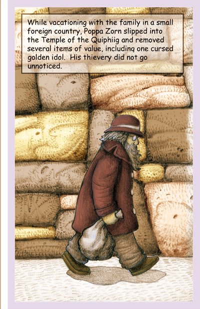
Very impressive Tom. It reminds me a little more of Moebius now, vs the earlier impression you were veering toward Geary. I really dig it but it must take forever. Nice rendering. Share your process.
The scanner and Photoshop layers are my friends. All the line work is just the raw pencils (2B - 4B) on Bristol that have been tweaked using color, contrast and brightness settings. I hate inking; brushes are too mooshy for me and I have a heavy hand.
I scan in the different background elements and characters separately and put each in a different layer. This lets me play with the composition until I get the spatial relationships the way I like. It's like playing with Colorforms.
Each piece of text, text box, word balloon, and color get their own layer and I adjust alpha, color, contrast, levels and filters to my heart's content.
That makes it even more impressive (to me) that so much of that handmade look of color pencil layering is all photoshop savvy. And the seperation of background and character and compositing later, very stimulating to think about. Like you say, who really likes to ink.
Wow these are cool! Yes very Moebius inspired. It's amazing all the work you put into the pages!!! It shows! I'm a photoshop n00b so I bow to your skillz! And the drawings are pretty good too. :-P
Post a Comment