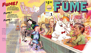
Ellis Edit
adding a jpg where I converted to cmyk. Flip back and forth.
No big deal. Dark contrasts got the most damage
What the heck. When I looked at it full size on the blog, it's nothing like what I preview with the mac. Hmmm. The little thumbnail doesn't have such flipped out / oversaturated colors.


13 comments:
Great blend of colors. The saturation choices are great. Blue boy and black haired Mom come forward a bit tto much but since the visual divides in half as a book cover- they're the reigning element of the back cover.
Since it is the color that knocks me out, right behind the great drawing of character, I worry that CMYK will give you a heartbreak. Do you know a way to check what you'll get for a published result? Have color proofs done by the publisher and see if edits are called for.
Looks fantastic, amazing work, bla bla bla... ;)
The first testimonial is fighting with a car in the background. Dropping the darkness of the car would probably fix it.
The bottom left corner of the front of the cover is the tile pattern of the wall... I'm wondering if that isn't an opportunity for some cover copy to further entice the audience or to add some dialog between the cover characters.
It really does look great. To address Ellis' concern, I've found that I always hand off a piece for print a bit brighter and more saturated than I want the final piece to be... you are always going to lose a bit of that going from screen to page.
The value on Teen E's portfolio maybe needs some more atmosphere blueing/ lightening. And the dark accents around the grill of the car contiguous to the portfolio. Maybe a different color, , same deal about value strength. And remove the character head between Teen E and the Woman's head.
"...And remove the character head between Teen E and the Woman's head."
I see what you're trying to do there, Goodson--and I almost fell for it!
These are all super-helpful comments, thank you guys. Yeah, CMYK is a heart-breaker...I am having the printer run me off a few examples of varying cool/warm/saturation levels. Rick, yes, I was gonna put some extra text on the blank tile wall. More needed to make quotes pop, I wanted to show this just to see how much further I need to go. They didn't seem to bug you guys otherwise, am I right? I'd like to do better with 'em...and I have yet to finish the street art in the distance...back to it!
Thanks again!
Correct... otherwise I think it looks grand!
I didn't comment 'cause I can't see anything that needs changing.
Tom, thank you.
Elz, thank you for posting yr CMYK/RGB conversion. I want to ask the rest of you how Elz's RGB version looks, 'cuz on my machine it is burnin' hot with oversaturation--I can't tell where my personal color preference ends and the color mode transfer begins (and just how Elz's "chromatically challenged" sensibilities figures in).
Marty, I guess the oversaturation image is semi legit. I just took your rbg image and changed mode in photoshop to cmyk. The hot color difference resulted. But I'm not a power user. I think there are options that make the cmyk conversion a gentler morph. I don't know them. There is also some technique I saw an illustrator demo. Where you can have all the colors (out of gamut? I think was the terminology) selected that you need to edit into printable color. Maybe some google search will turn that up. I'll look.
Here you go. A little Lynda learning. As he says early, if you are doing inkjet printing, forget this cmyk nonsense. That inkjet printer demands RGB mode.
Lynda Learning tutorial on CMYK conversion
On my computer there is not a speck of difference between the two versions. As I flip back and forth between the two, nothing happens on the screen. You couldn't even tell that they were being switched out.
Blogspot can be glitchy.
"...a gentler morph."
These nuggets of Goodsonian communication!
Tom Moon, that's incredible--on mine the difference is BIG. This conversion to CMYK has caused me many headaches in the past (fer inst, all my Monsters & Dames contributions). Amazing it could be so different on different machines...I do think the Blogger compression has something to do with it...I think???
Anyhoo, thanks for the help!
Check out the youtube. I've kept it bookmarked.
Post a Comment